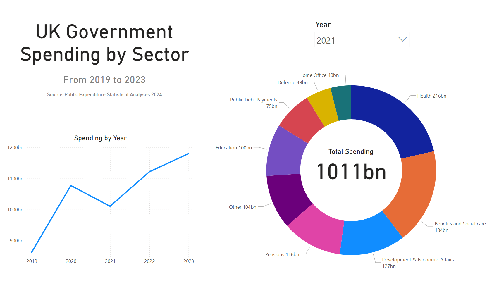
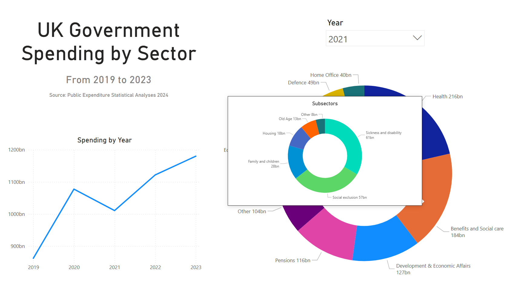
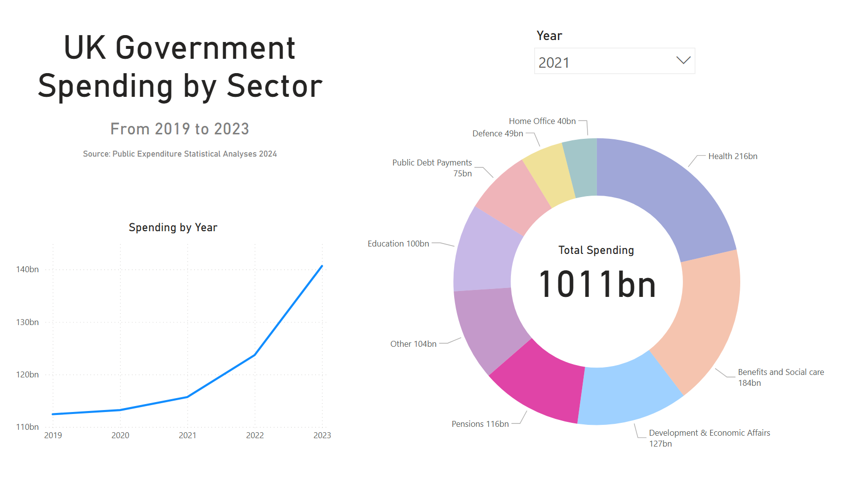
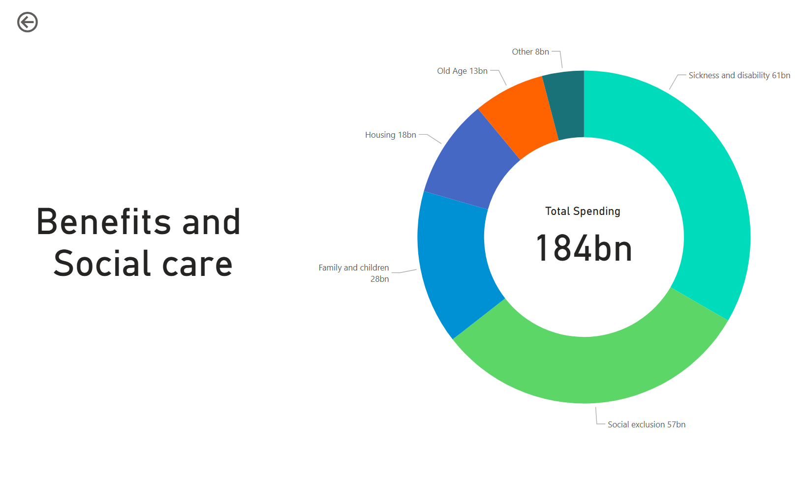
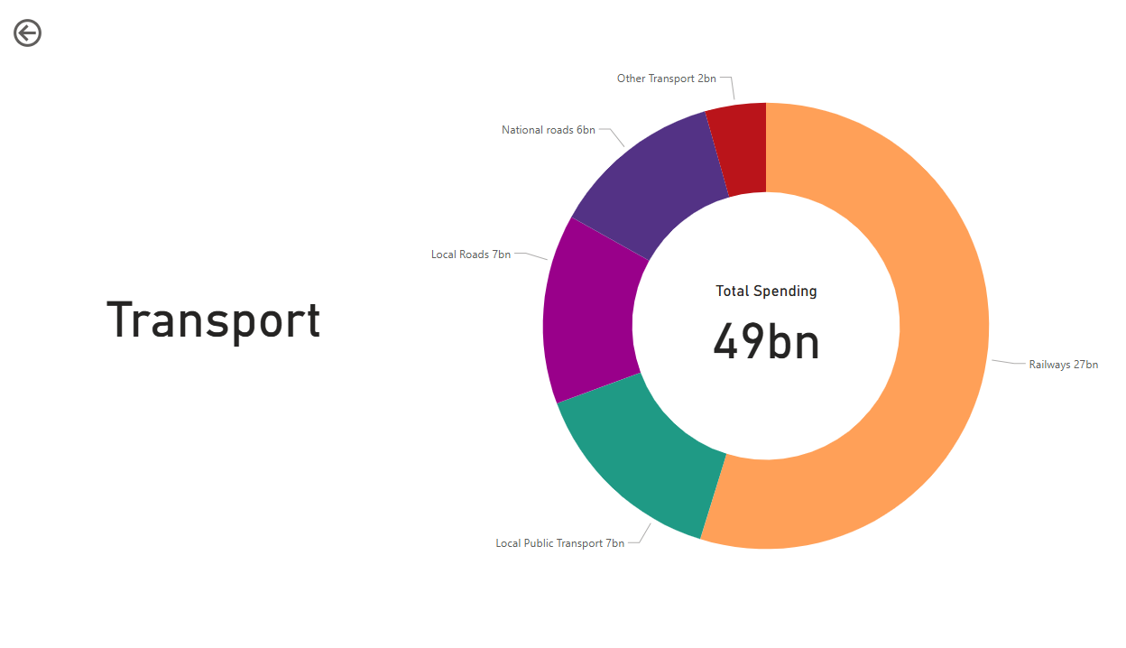
Government Spending (Power BI)
A dashboard that summarises data from the 2024 Public Expenditure Statistical Analyses, made with Power BI. It has donut charts representing the share of spending per sector, with the ability to drill-through once to view sub-sectors and drill-through twice to view breakdowns of these sub-sectors.
Hoving over a sector or subsector shows a tooltip displaying a detailed breakdown of spending, and clicking the sector will make the chart on the left show the trend in spending for that sector over time.
Required data-cleaning to make sure all categories were easily understandable and grouped in a readable way. Imported data was manipulated using PowerQuery, and DAX was then further used for measures.

Character Popularity (Power BI / SQL / Python)
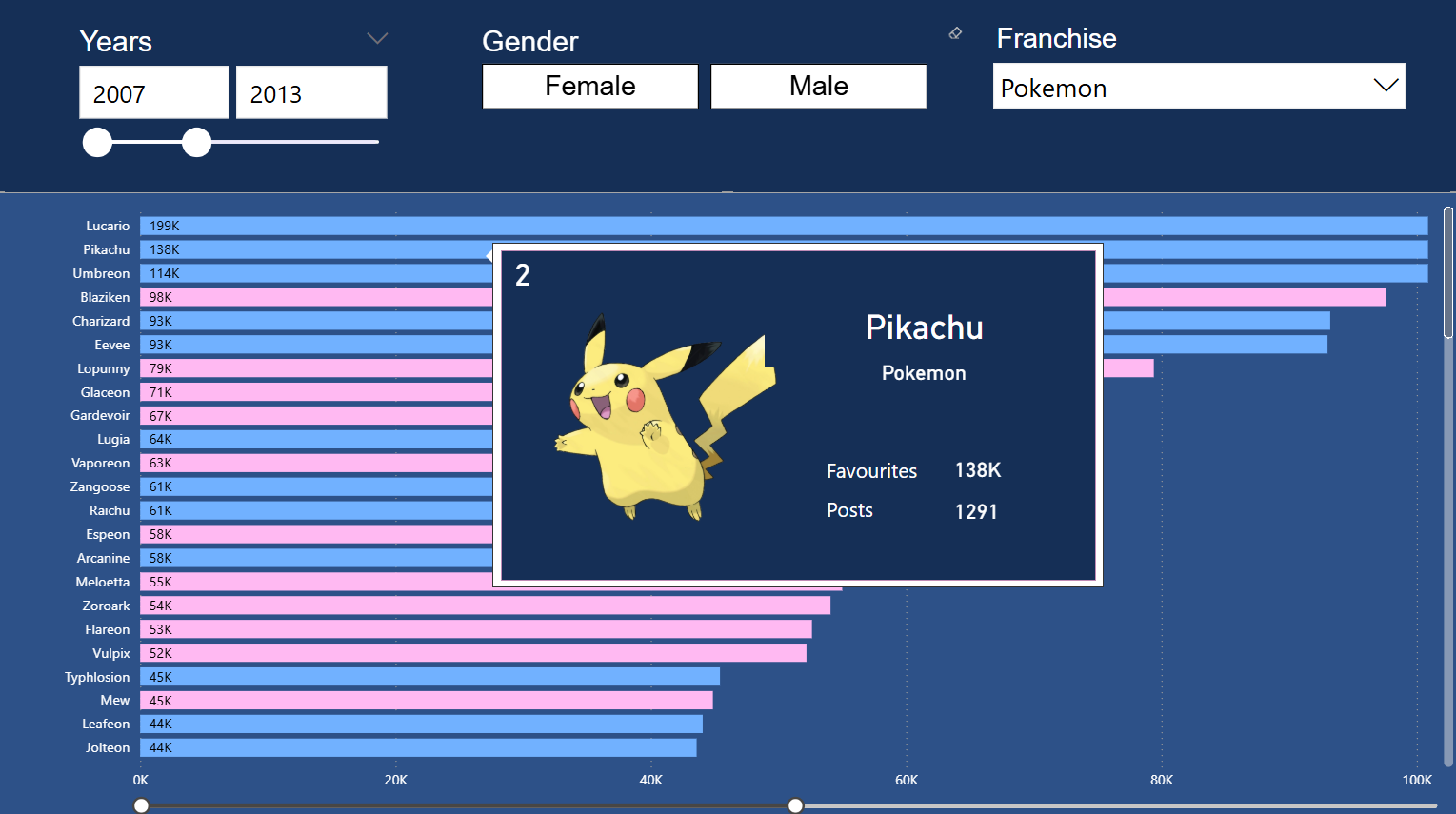
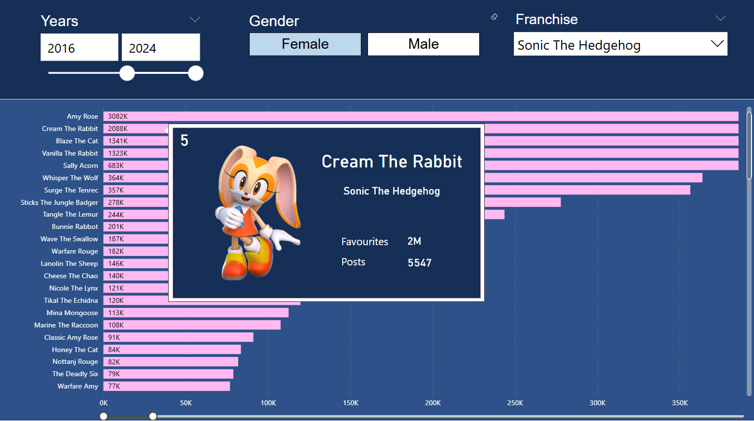
A Power BI dashboard which shows the popularity of characters across a variety of image boards. Has a bar chart representing the amount of favourites/likes accumulated on the site, with a colour to show gender. Slicers filter the data by franchise, gender and range of upload years. Tooltips display more detailed data such as rank, post count and an image when hovering over a character's name.
Required data-cleaning using both Python and SQL to get data from multiple sources to be in the same structure. Used PowerQuery to finalise the data upon import and DAX to calculate additional information and produce labels.
Created a web-scraper in Python using the library Selenium to gather the images, which simulates a user searching for an image, clicking the image to expand it, and copies its source URL.